Looking for great examples of user friendly intranet solutions to see what the technology could offer you? We’ve got you covered.
If your business has spent the past year working remotely, you’ll be aware that having the right technology makes all the difference in maintaining employee productivity across different locations.
According to research by global recruitment firm Robert Walters, over half of work-from-home employees felt that their employer needed to invest in technology that would make it easier to work remotely. And, with remote working looking set to stay for the long term, it’s now more important than ever to think about how you invest in intranet platforms going forward.
Central to an effective digital workspace is a modern intranet platform, which facilitates heightened employee engagement, inter-departmental collaboration, employee training, and corporate communications.
Intranets also ease administrative pressures on busy HR teams via automation of routine tasks. This frees HR professionals to spend more time on important case work and less time on low-value business processes.
What does an example of a great intranet look like? We showcase some of the best company intranet designs below, so that you can use them for your own inspiration.
1. Transparent intranet design: Emergency Physicians of the Rockies
(Source: https://legacy.claromentis.com/customer-success-stories/epr/)
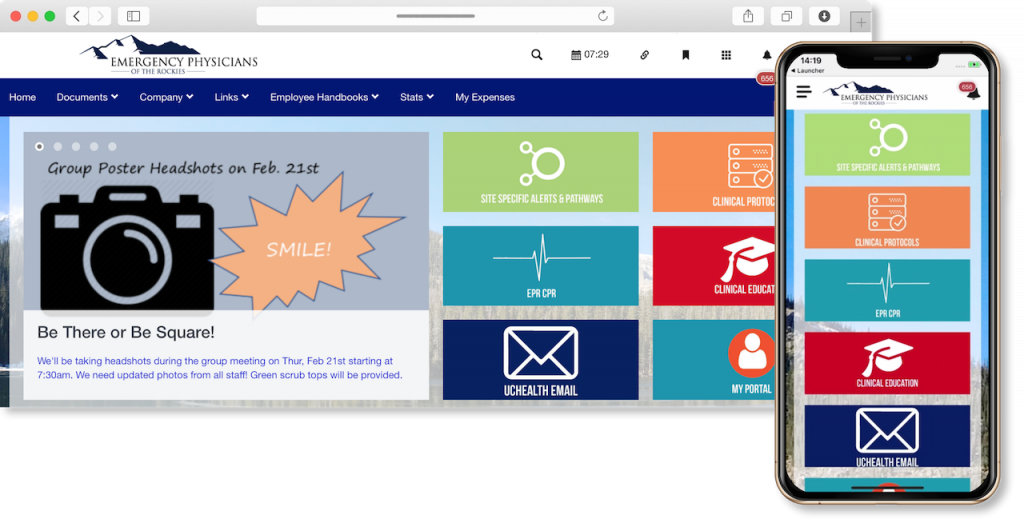
Emergency Physicians of the Rockies (EPR) provide emergency medical care in northern Colorado. Their busy workforce needed a digital workspace that prioritised speed and efficiency via real-time access to key information, and instant communication and collaboration tools.
From the moment you login to the intranet homepage, this intranet page makes it as easy as possible for users to find the function they’re looking for – perfect for a workforce where time is always of the essence. A clean, accessible grid system pinpoints exactly where to find important information like ultrasound scans, reviews, and key compliance documents.
Adding learning management features to this intranet design has also allowed EPR to streamline the regular training they provide their medical teams, boosting efficiency with on-the-go access.
2. Employee engagement focus: Midwest Energy & Communications
(Source: https://legacy.claromentis.com/customer-success-stories/midwest-energy-communications/)
Midwest Energy & Communications (MEC) helps create vibrant rural communities by providing power and fibre-optic broadband to areas overlooked by big utility giants.
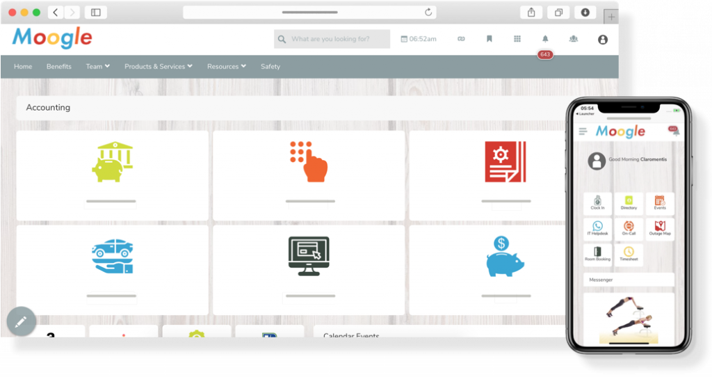
With staff spread across five offices and a large core of field-based employees, MEC needed a solution that facilitated internal communications across different locations. The intranet also needed to act as an employee collaboration tool, so that remote employees felt as much a part of the organisation as their office-based colleagues.
The user experience this intranet provides is clear. It’s uncluttered, easy to navigate, and entirely optimised for mobile. The ‘Moogle’ branding is a nice extra touch – emphasising the intranet’s role as a central repository for all company communication and adding a vibrancy which reflects MEC’s values on their company mission statement.
3. User friendly intranet: SeriousFun Children’s Network
(Source: https://legacy.claromentis.com/customer-success-stories/seriousfun-childrens-network/)
SeriousFun provides camp experiences to children with serious illnesses, who might not otherwise be able to attend a summer camp.
Their ‘Funtranet’ is designed expressly to provide their global workforce the opportunity to collaborate and share information.
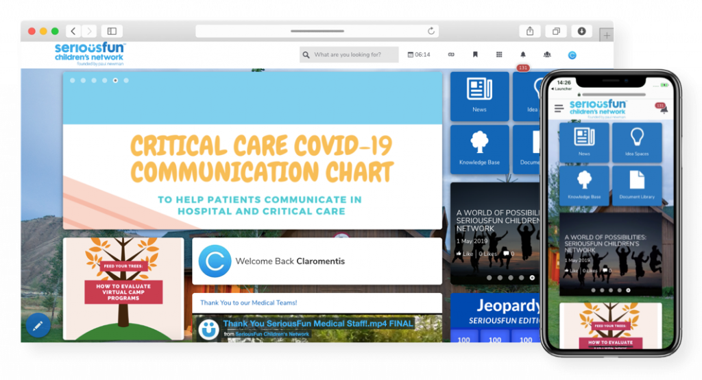
An easy-to-use corporate social networking tool provides a solid base to connect employees across the organisation. Meanwhile, staff use the document management system to centralise best practices and share files, taking knowledge management flow across the organisation up a gear.
The four tiles on the top left of the desktop screen provide an instantly understandable way to find and access key functions – and they translate well onto the mobile design. As many SeriousFun employees aren’t desk-based, this is an ideal way to keep the team informed without them having to remember to check emails between tasks.
4. An intranet page with added project management features: Apprenticeship Connect
(Source: https://legacy.claromentis.com/customer-success-stories/apprenticeship-connect/)
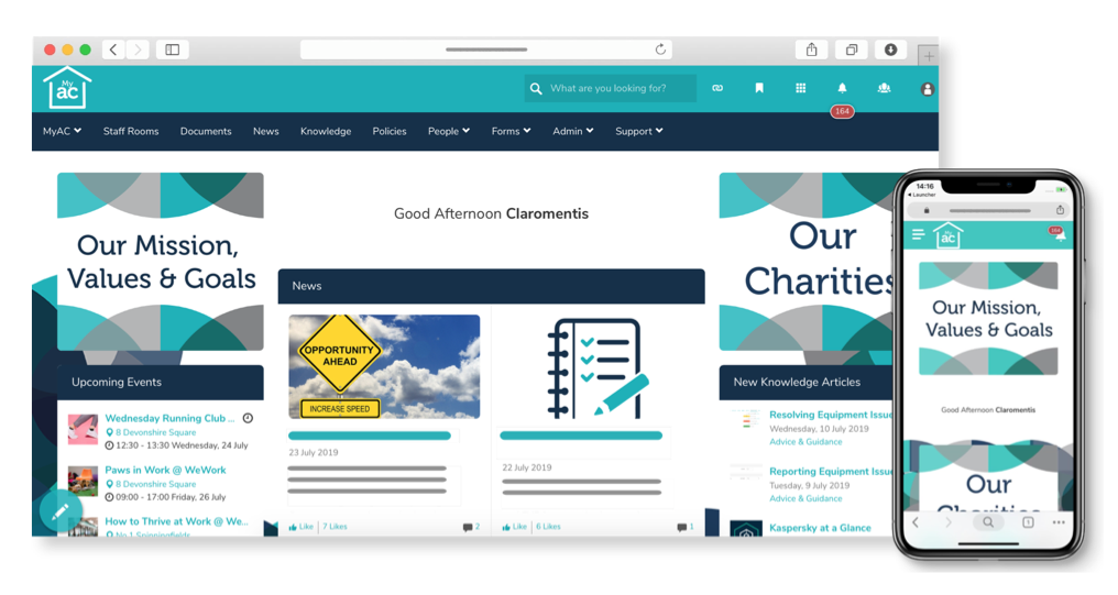
UK-based training provider Apprenticeship Connect works across the UK to provide quality apprenticeship courses. The company needed a successful intranet that would allow its teams to collaborate on projects remotely without losing productivity on business goals.
At first sight, this intranet homepage design emphasises a shared purpose by making the ‘Our Mission, Values and Goals’ section highly visible on both mobile and desktop. With extended project functionality, business process management, and centralised document storage, the intranet provides a user-friendly avenue for remote collaboration.
The placement of ‘New Knowledge Articles’ on the top right offers a useful at-a-glance way of keeping up with best practice from around the business. This underlines a company commitment to facilitating collaboration at a broader level, while encouraging users to check for internal communication from across the business.
5. All-in-one digital workplace: Carolina One
(Source: https://legacy.claromentis.com/customer-success-stories/carolina-one-real-estate/)
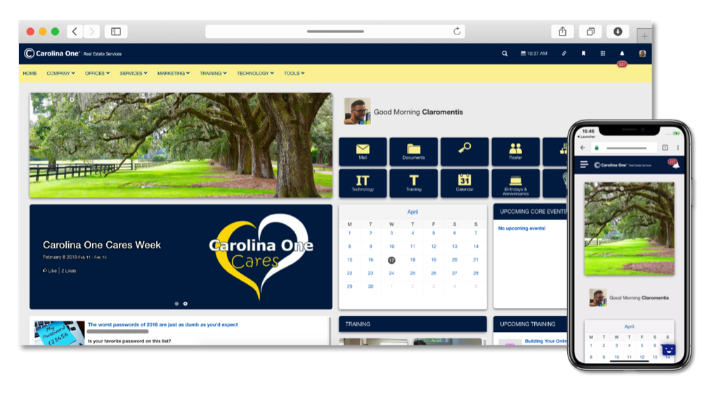
Carolina One is a prominent real estate firm that operates across the Carolinas. With a 900-strong workforce across 15 offices, the business needed a comprehensive digital workplace to take care of a range of HR functions.
This intranet was designed as an all-in-one digital workplace to replace a legacy intranet, facilitating everything from company news and document storage, to knowledge sharing, calendars, and messaging. It even includes a tool to keep on top of staff birthdays and anniversaries, helping to create a friendly and accessible company culture.
Despite the volume of functionality Carolina One’s intranet platform offers, the homepage prioritises features that are of most immediate use to employees. The central placement of the calendar makes it easy to quickly check appointment times (essential for real estate team members). Meanwhile, company news announcements are clearly visible without obscuring more operational, day-to-day functions.
![[FREE GUIDE] 10 TIPS THAT WILL MAKE YOUR INTRANET A SUCCESS](https://no-cache.hubspot.com/cta/default/5025095/6a549aca-8d9d-4916-84ed-c9f30edd10b0.png)
