They say “don’t judge a book by it’s cover”. But in reality, it’s the reader’s first window into what’s inside. The front cover’s fonts, colours, images, and taglines all convey meaning, setting people’s expectations about what they’ll be reading.
Believe it or not, the same is true for your intranet homepage design.
Why intranet design is important
Research shows that 94% of a website’s first impressions, and 75% of its credibility, come from design. These stats highlight how a positive web design experience is crucial for attracting and retaining consumers, as well as gaining their trust.
This applies to your intranet design too. If you present your employees with an uninspiring intranet homepage, chock full of text, unreadable fonts (think Jokerman), and no images, then don’t be surprised when they never return.
Like a good book cover, good homepage design gives your staff a window into your organisation’s values, culture, and business goals. A shoddy user interface could give the impression that these vital assets are an afterthought, which is certainly not the impact you want to make.
So it’s important that you put the time and effort into making your intranet homepage as clean, modern, and intuitive as possible to make a good – and lasting – first impression.
Here’s how to do it:
How to create a good intranet homepage design
Understand your users’ needs
The foundation of good intranet design is understanding what your team members need, and making that a priority.
For instance, if your staff want to be better informed and in-the-know about organisational updates, then make company news and internal communications tools prominent features of your intranet homepage.
On the other hand, if teams want to improve how they work together – which is especially important for remote teams – then promote employee engagement and social features on your intranet homepage to boost collaboration.
Carefully choose your intranet homepage content
Intranets of yesteryear were notorious for housing content that staff weren’t interested in. Whether that was a dull blog post from the CEO that most staff hadn’t met, or company updates that had no relevance to frontline workers, intranet content was often misaligned with team member’s needs.
That is until intuitive content targeting tools and a better understanding of the power of good intranet content came along.
Use content targeting tools to push relevant content to teams
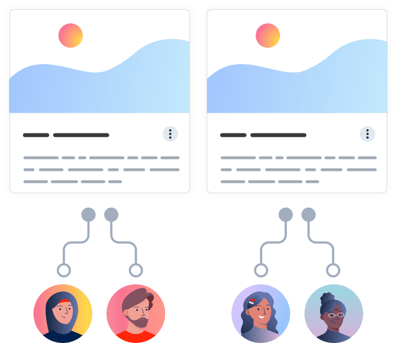
Content targeting tools enable you to specify which teams see which pieces of content, such as particular news articles, company announcements, collaboration spaces, upcoming events, and mandatory policies that are awaiting acceptance. In this way, every team member’s intranet homepage design is unique – they only see the content they need and want.
Posting engaging, up-to-date, and – most importantly – relevant intranet homepage content will solidify your intranet as being a trustworthy source of information, and will encourage teams to come back.
Make your intranet homepage design mobile friendly
The number of people using their mobile device to access websites is constantly growing, and now accounts for 54.8% of all web traffic.
Therefore, it’s vital that your intranet homepage design is as easy-to-use on mobile as it is on desktop.
For example, be mindful of not making intranet navigation menus too long, because these will translate badly when accessed on mobile devices. Similarly, break up large pieces of text into smaller paragraphs to make it easier to read on smaller screens.
In fact, consider adopting a mobile-first approach to intranet design when planning your intranet project. Doing so will ultimately benefit both your desktop and mobile users, because it will provide a clean and uncluttered user experience for all.
Intranet homepage examples
So, we now know why good intranet homepage design is important and how to get it right. Let’s take a look at some intranet homepage examples to see the process in action:
Carolina One Real Estate
Founded over 50 years ago, Carolina One is a real estate leader with more than 900 sales associates across 15 different offices. The teams needed to replace their outdated intranet with modern digital technology that easily connected their staff to company information, upcoming events, and training classes.
(Source: claromentis.com)
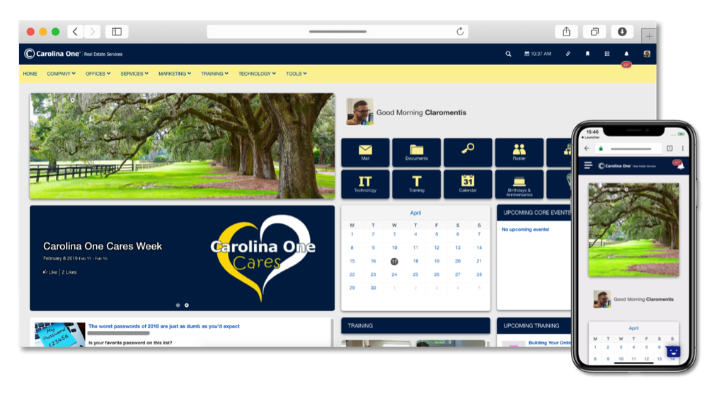
You can see this reflected in their intranet homepage design. For instance, the company’s latest event – “Carolina One Cares Week” – is prominently displayed so that staff can see it and sign up instantly.
The homepage also features two widgets called “Upcoming core events” and “Upcoming training”, which gives staff an at-a-glance view of events that are being hosted soon.
Apprenticeship Connect
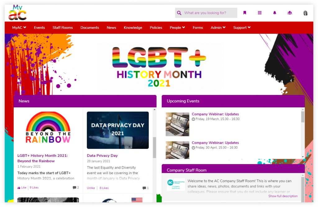
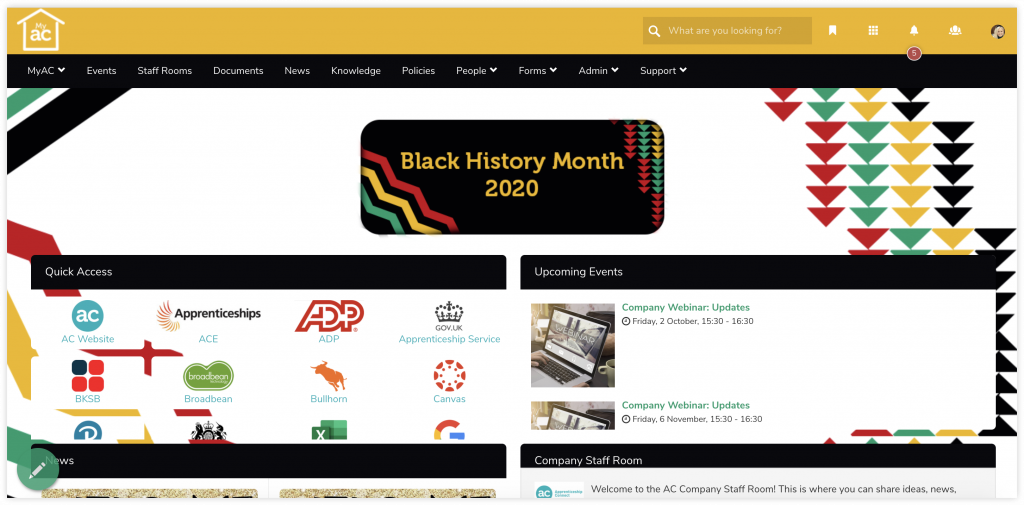
A core value for UK-based training provider Apprenticeship Connect is being able to increase awareness of their equality, diversity, and inclusion programmes. Intranet design tools allow them to do just that, by allowing teams to rebrand their intranet homepage design to host “takeover themes” in support of key dates such as LGBT+ History and Black History Month.
(Source: claromentis.com)
Thanks to content targeting tools, the teams are also able to promote specific events and news articles related to the takeovers, to further boost awareness.
Boost.ai
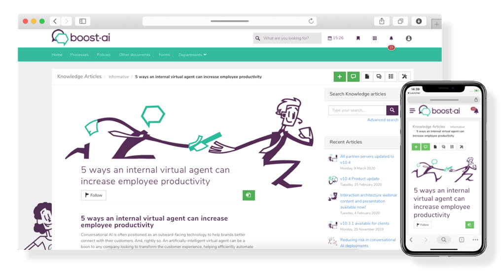
Conversational AI software company Boost.ai needed an intranet solution that connected their delivery partners to important information such as onboarding documentation, product details, and educational events.
(Source: claromentis.com)
This much is clear when looking at Boost.ai’s intranet homepage design, which focuses primarily on knowledge sharing and training up their external partners. The “Recent articles” widget on the right makes it easy for staff to find related content, and the mobile-friendly layout enables teams to learn on-the-go.

![[FREE GUIDE] 10 TIPS THAT WILL MAKE YOUR INTRANET A SUCCESS](https://no-cache.hubspot.com/cta/default/5025095/6a549aca-8d9d-4916-84ed-c9f30edd10b0.png)
